Some of the most lasting songs to human existence are in the form of inhuman edifices, monuments to long-forgotten peoples and Gods with no names. We have always cherished our monuments, and sculpture, the creating of form, has played a part in it since before we had a name for it or the tools to craft it with the finesse we have come to expect since. It’s only right that paper too bows down to the need for sculpture, and in some ways all we do with paper is sculptural, the creating of form by folding, moulding, cutting and shaping the sheets and fibres into newer, more human monuments in miniature.
Ever since I started this site, engaging an audience and growing one to share my slightly different take on paper craft with, has been a central need. It was for this reason that I set up a Facebook page, hoping that would grow into a steady stream of interested people in time. I’ve had a lot of support and encouragement from friends on Facebook for the work I am growing here, and many people I don’t personally know have joined in and been an inspiration in keeping this flowing. Recently I realised the Facebook page was soon to reach a hundred followers and decided I should thank those who joined by doing a bit of monument-building of my own, or at least some paper sculpture.
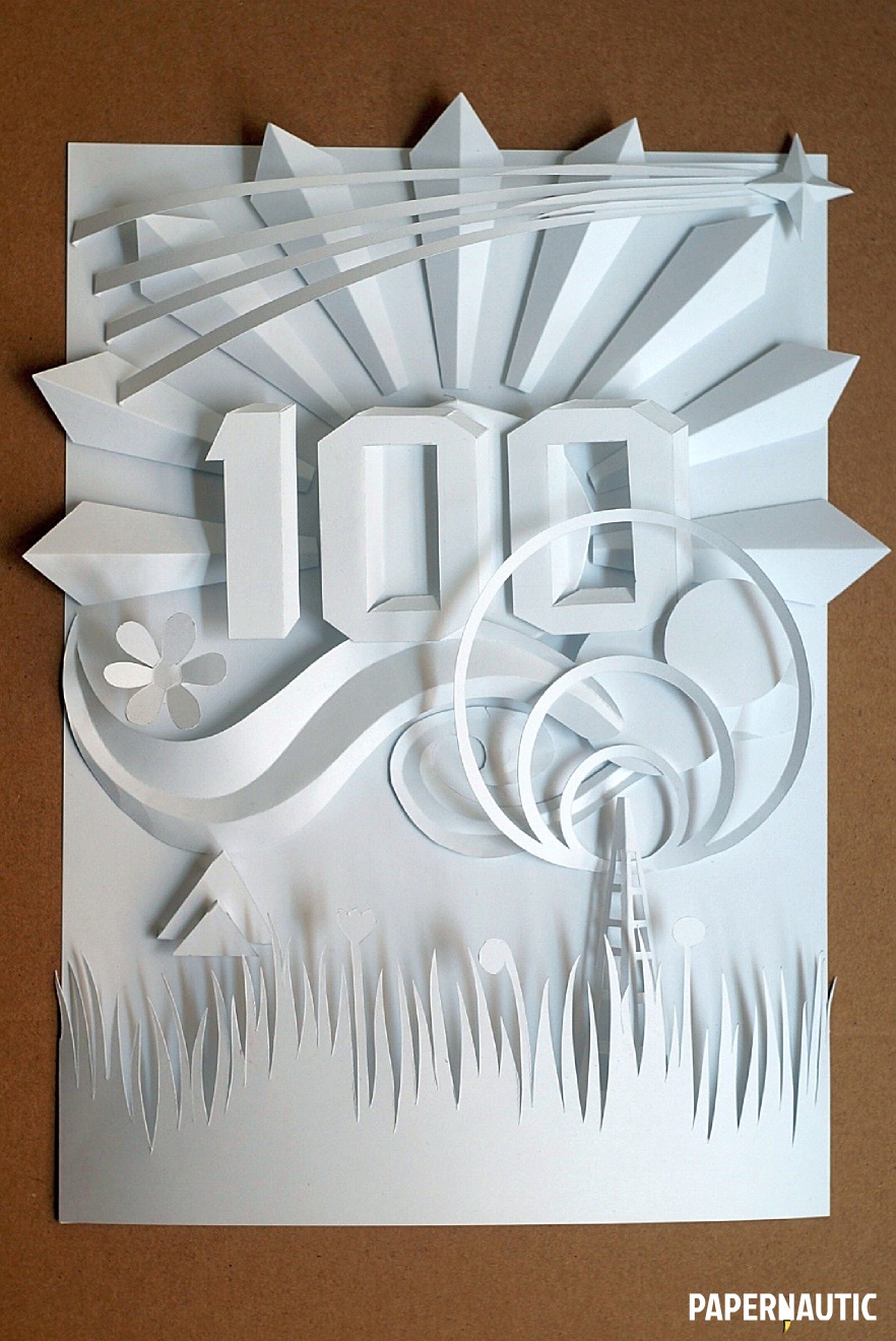
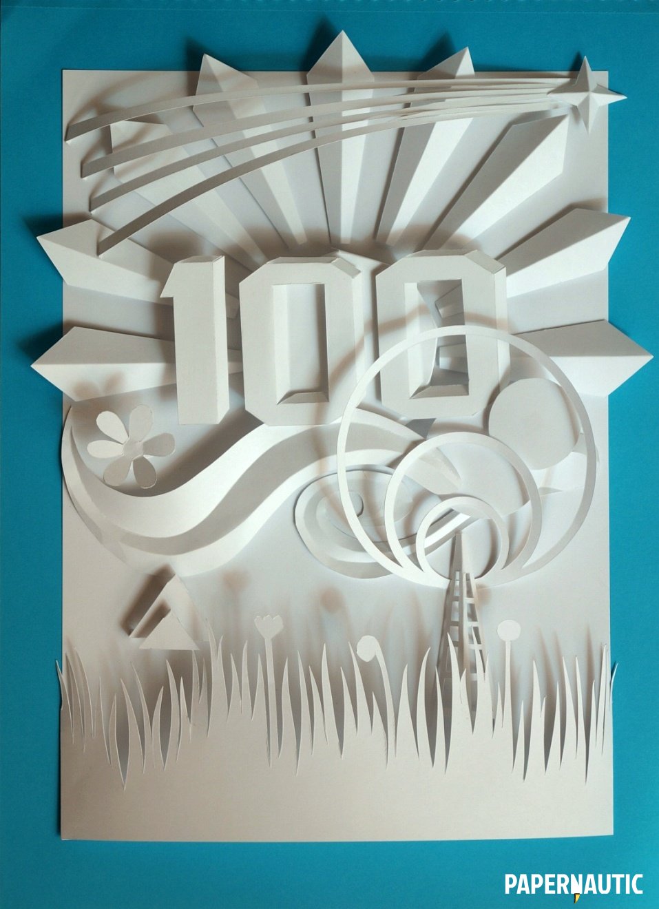
This is what resulted. A milestone in paper relief. Something to keep me going and keep me experimenting in new forms and techniques, and something pleasing to behold. Here is an account of how it came to be constructed.
The Idea
From the very beginning I knew I wanted the number “100” to be central to the piece, so my sketches concentrated on that and then on building elements and scenes around it. Having decided on paper relief, I wanted to try certain particular curvilinear forms and layering techniques and so some choices of content were made by my experimenting necessities.

As you can see from the piece of sketch above, the ideas were all over the place. My original sketch had some of the elements the final relief has, and some, like curtains and a stage theme, which I discarded as superfluous as I worked on it further. Starting with a sketch helps immensely in seeing what works and doesn’t before you ever cut into a sheet of paper, and is essential for coherent results. As is gathering the materials to be used and seeing what ideas they suggest to you by their qualities. For this piece I exclusively used A4 sheets of 160gsm copy paper, and many of the forms were chosen due to its stiffness.
Design & Construction
When it comes to one-off unique pieces like this, the design and creation process really happen in parallel, and perfect pre-planned templates cannot be made. There are always things even in detailed drawings and schematics which will work differently in the actual materials and in the third dimension. In an original piece, or when making the first piece of a repeatable design, part of the task is in making adjustments to what can be done from what you expected in theory.
Paper relief typography

In tackling the typography, the first order of business was sketching out the digits I needed. The idea was to draw them with forced perspective, which could then be enhanced with creases to add to their depth. Getting the shapes that are meant to form the depth of the letter-form right was the tricky part, keeping in mind that they need to work not as drawn shapes but as shapes to be folded away from the plane of the paper to enhance the illusion.


Once the major shape was cut out of the sheet, it was down to making the proper cuts at corners which would allow the folded portion to form a convincing three-dimensional form. At the corners, wedges of paper were cut out so that the two planes could meet at a proper angle without overlapping. To create crisp creases, the edges of the letters were scored with the back of the paper knife before folding.


The results, in the single letter-form and the overall “100” figure is quite convincing, as you can see, especially once all construction lines and pencil marks were cleaned away to let the light and shadow be the major delineating element. An essential part of making it more sculptural rather than illustrated.
Paper sculpted motifs

There are various motifs I wanted to try in this relief sculpture, chief among which was the dazzle of graphic rays emanating from the sun and our “100” centre-piece. This is a common motif in vintage posters and modern advertising, and marketing graphics continue to use it. This part of the form needed some precision and so the shapes were based off a properly constructed semi-circle and radial shapes.


Each ray element could then be individually cut and creased along its centre to create the simple but effective form. The rays set up around a circle would form the perfect central motif of this dimensional image
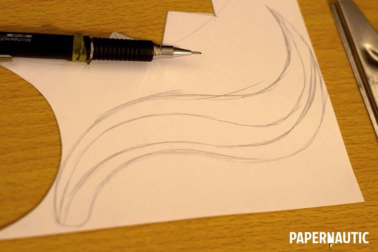
The other challenge I’d set myself right from the sketch stage was to tackle a certain type of sinuous, curving form, which I’ve seen executed beautifully in paper relief. After having done the basic layout of the digits and central piece, I drew this shape freehand for it to fit under and overlapping a bit with the Sun motif. This sort of thing can really only be created as the layout comes together.

Once again, creasing along the internal lines with the back of a paper knife, and folding in alternating directions adds both dimension and enhances the curves of the paper, making it curl into itself with the tension of the creases.
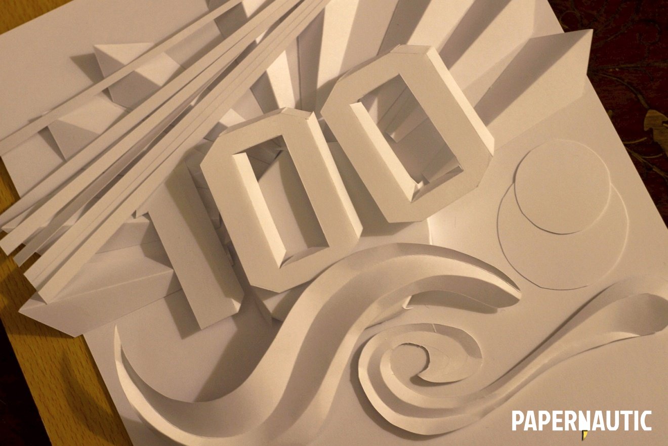
Adding more curved forms, a couple of simple circles, and a burst of activity on top with radial strips completed the top half of the composition for me. It was coming together nicely and thus far I’d stuck quite closely to the original plan. The rest was to be decided.
Paper cut scenery

It was the bottom half of the original sketch that required the most editing. My idea of a stage setting was not holding up as I worked on this and I wanted something less restricted and more airy. So I decided to create an outdoor scene in abstract. With the Sun in the sky, it made perfect sense. This required some natural landscape and since I didn’t want to return to the cliché of hills in the background in this instance, I chose some foliage. Added to that, an antenna of some sort along with a few other elements were drawn freehand or constructed to be cut out.

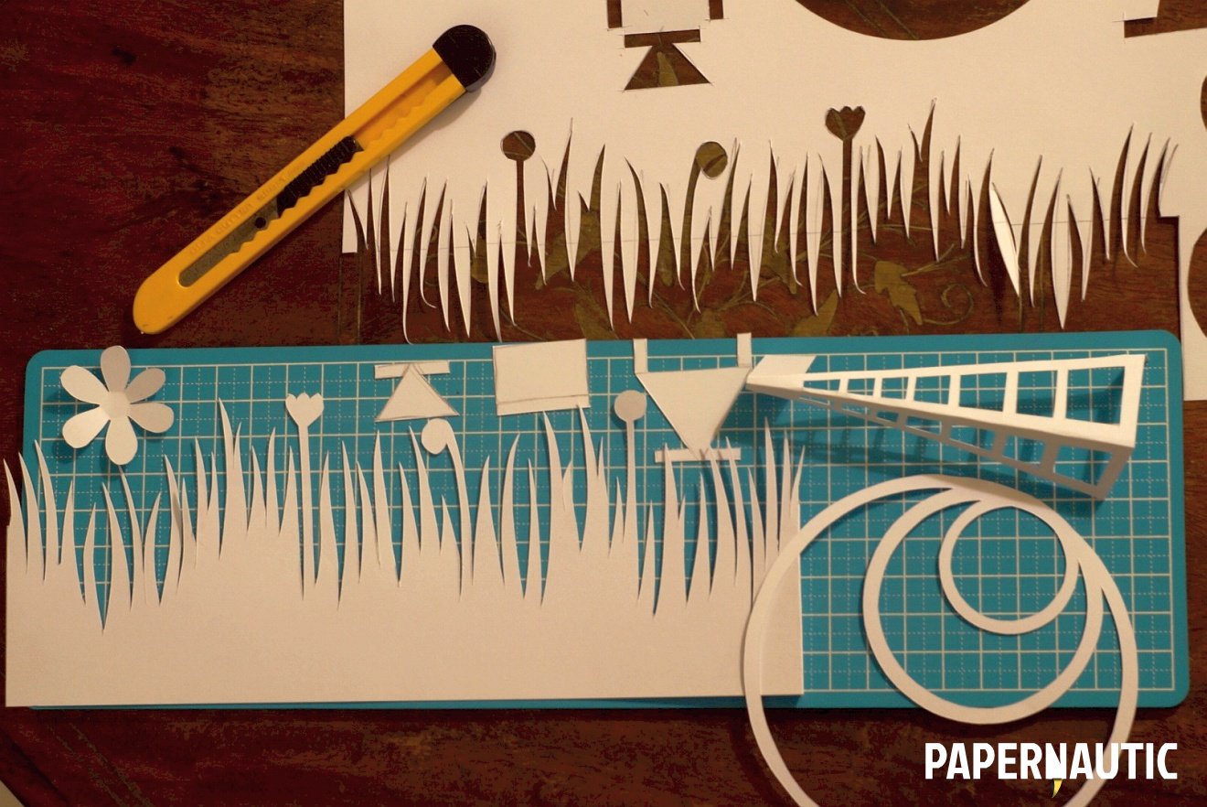
Objects like the antenna with plenty of tiny internal shapes required some delicate cutting. Once they were freed of the sheet of paper and creased with the knife where required, all the elements of the bottom part of the page were ready to be placed.


Now that all the pieces were done, I laid them all out on the page, in position but not necessarily in the exact layering they would finally appear. At this point you still have the luxury of testing and tweaking the composition, so it’s best you use it to iron out any rough edges. Step back, look at how things fit together and move things around if required before they are fixed in place.
Assembling the paper sculpture

The major part of assembling the pieces into a finished sculpture is in deciding how these flat shapes and some folded forms can be fixed on to the plane so that they stand up and out to create the depth you require. Some forms, like the antenna, lend themselves to be created with flaps, as shown, so that they can be easily fixed to the plane. Some of the later shapes I created, including the foliage, were designed with that in mind.

Some shapes, however, like the digits. the rays and the waves emanating from the antenna, need to look free-standing and so cannot always be designed with flaps for easy assembly. In these cases, the attachment needs to be kept discrete, so that they take on the effect of floating or just being weighed down on the plane of the relief.
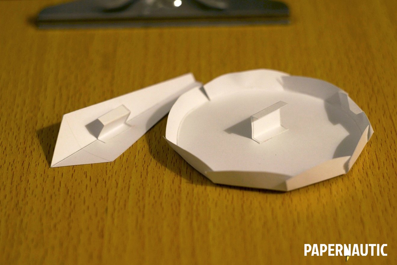

The solution is creating little flaps of paper, strips and rectangular pieces that you can affix to the centre of shapes, so that their attachment is mostly invisible. You can see how such simple additions were used to stick both the Sun and the digits down into the relief.

With existing flaps and added appendages, all the pieces were brought together in a slow systematic way. This is a job of patience because each layer really needs to be glued in properly and fastened well before more can be added.

The final piece creates an image you can achieve in no other way than by using paper in this particular sculptural mode. The central trick of paper sculpture, especially when using white paper, is in creating the best play of light and shadow where you have no colours and drawn lines to create the image. You are as much sculpting the light here as you are sculpting the sheets.
I’m quite happy with the result and the response to it by all has been overwhelmingly positive. This has been a good experiment and learning experience, and may it be the first of many into paper sculpture. Thank you all for the encouragement and hope some of you do some experiments of your own in this direction.
Paper is both delicate and very forgiving.